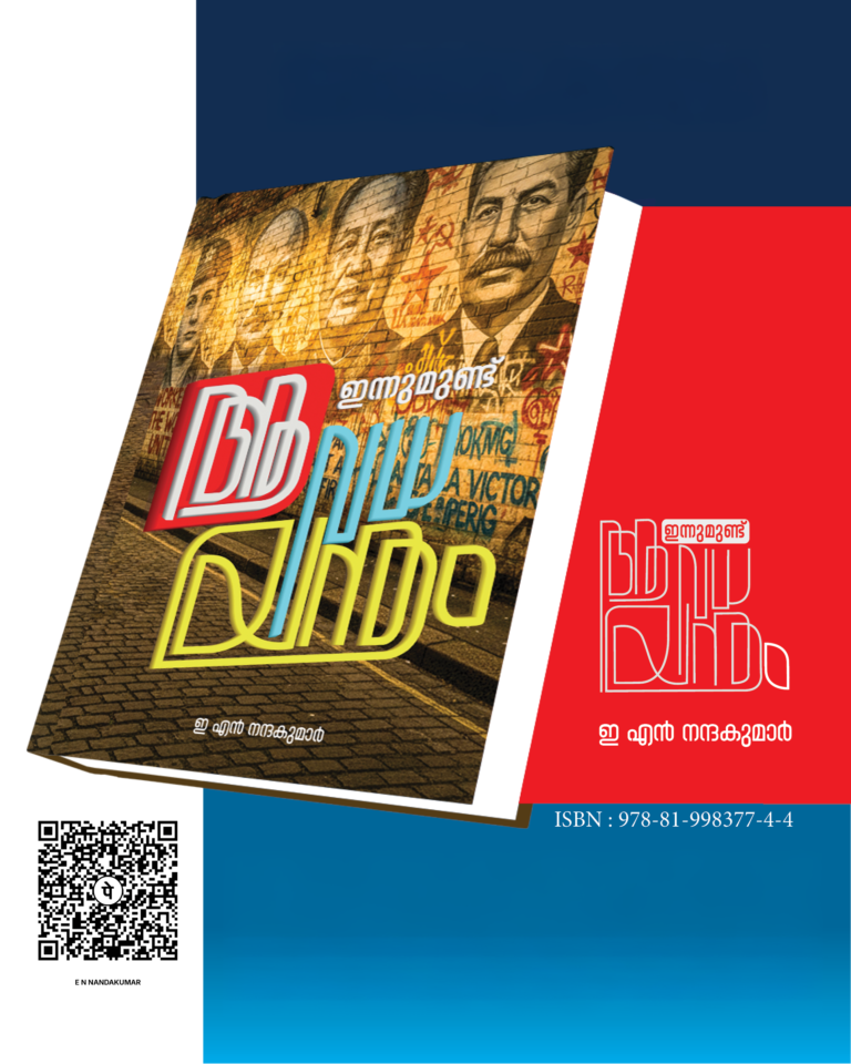
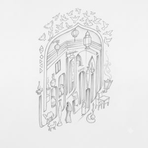
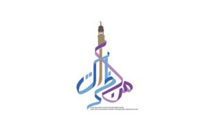
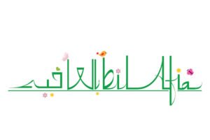
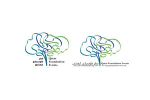
For KG Manoj, calligraphic design is not simply the art of beautiful lettering. It is a space where illustration, typography and graphic design meet – where a word can become an image and a title can acquire a visual identity of its own.
The process begins with the idea of the final form. How should the word feel? What should its shape communicate? How can the character of the lettering become part of the meaning?
In calligraphic designing, letters are not merely carriers of language. Their weight, rhythm, movement, proportion and spacing become part of the visual expression. A word may need to feel graceful, powerful, playful, traditional or contemporary, and the lettering evolves accordingly.
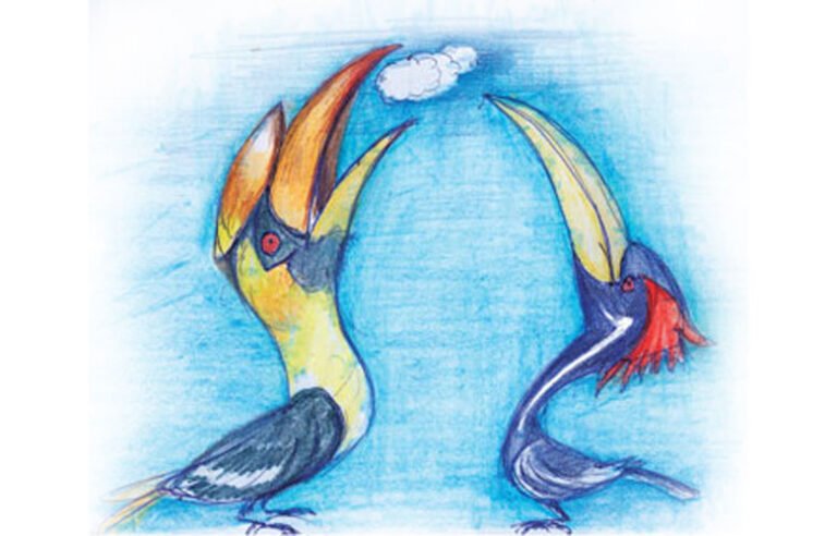
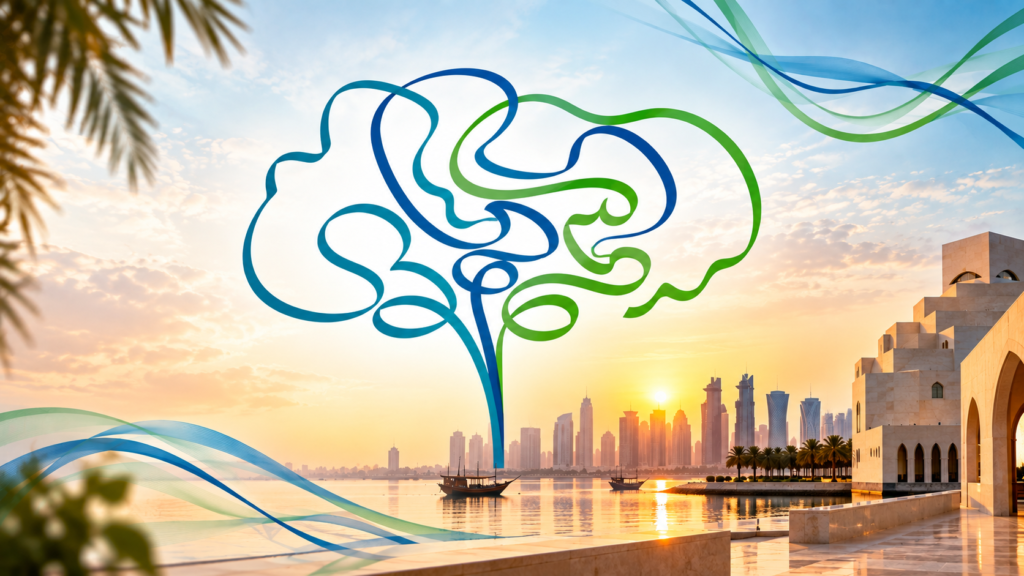
This makes the process a meeting point between writing and drawing. Letters can be stretched, compressed, connected or reshaped until they work together as a single composition. At times, surrounding imagery becomes part of the lettering; at other times, the letters themselves become the illustration.
For Manoj, the most engaging part is this transformation—the moment when a title begins as language and gradually becomes a visual form.
The final design is a balance between readability and expression, typography and illustration, tradition and experimentation.
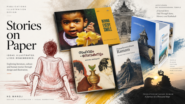
Across his wider practice in publication design and illustration, calligraphy becomes another way of exploring visual storytelling.